In this fifth post under the series “Understanding the KGFS Customer” we present the analysis of data regarding the income of customers enrolled with KGFS.
- This blog post presents data of enrolled member across five KGFSs – Puduaaru, Vellaaru and Thenaaru from Tamil Nadu , Dhanei from Orissa and Sahastradhara from Uttarakhand, taken from the Customer Management System (CMS).
- Data considered for this post is as of 28th April 2012
- There are a total of 191,712 enrolled customers. Pudhuaaru has 138098 enrolled members, Dhanei – 28,270, Sahastradhara – 24,229, Vellaaru – 787 and Thenaaru – 328
- The total number of KGFS households are 120,111 of which 82,354 belong to Pudhuaaru, 18,301 belong to Dhanei, 18,538 belong to Sahastradhara, 663 belong to Vellaaru and 255 belong to Thenaaru
- The dataset used for this post contains information of 5,09,879 persons which includes enrolled customers along with their family members. Out of these, 2,63,478 persons have reported income of some sort and hence are considered for this analysis.
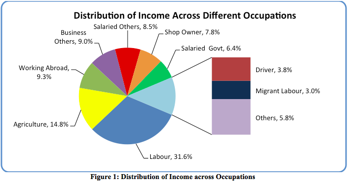
Figure 1 above shows that the highest proportion income (31.6%) is contributed by persons involved in labour activities. This is followed by agriculture (14.8%) and by people working abroad (9.3%). The occupations which contribute less than 3% of income in the pie are clubbed as ‘Others’ which comprises of occupations like agri-trading, dairy, fishing, etc.
Income Distribution across KGFS
The following figures present the income distribution for individuals and households across each KGFS. The red braces [ ] in each graph shows the range between the 10th and 90th percentile. This range represents the region where the income of 80% of the segment lies. The two red dotted lines indicate Median and Mean income earned respectively.
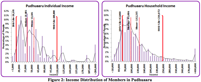
For example, in the above graph 80% of individual income of Pudhuaaru customers lies between Rs.14,578 and Rs.108,000. The median is Rs. 37,485 and mean is Rs.53,145. It can also be noticed that the household income has a smoother graph than individual income mainly because at a household level the incomes of several individuals get aggregated.
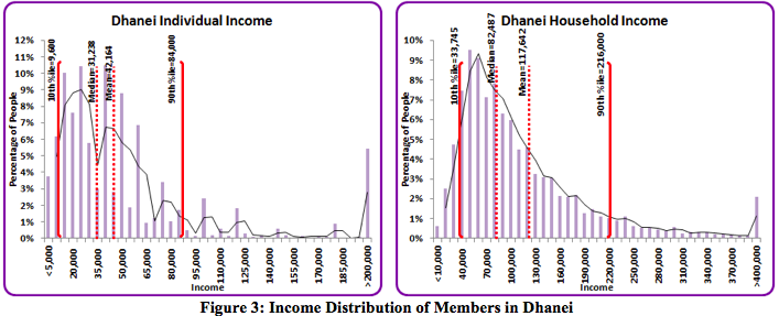
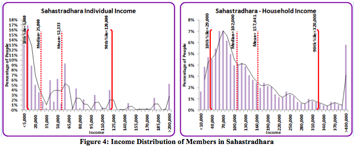

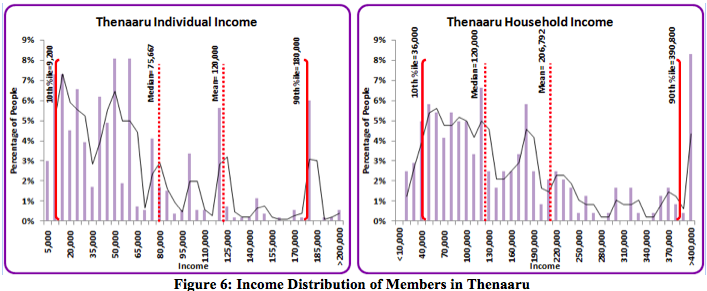
From Figure 6 it is seen that Thenaaru has the widest distribution of income followed by Sahastradhara. In contrast, Dhanei has the narrowest distribution of income. When mean and median values are very close to each other it suggests that there are a lower proportion of extreme incomes in that segment. This phenomenon is true for both Pudhuaaru and Dhanei.
Household income disparity
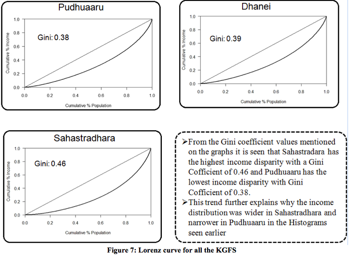
To measure the household income disparity across KGFS we used Lorenz curve and Gini coefficient. Lorenz curve [wiki link] is a graphical representation of income disparity which is seen from the distribution of income of the people living in that region.
The Lorenz curve for all the KGFS with the income measured at the household level and their respective Gini coefficient is shown below.
Detailed analysis of top 5 occupations
The following top 5 occupations which constitute about 73.2% of the total income are considered for further analysis.
1. Labour (31.6%)
2. Agriculture (14.8%)
3. Working Abroad (9.3%)
4. Business Others (9%) These are business or trading activities undertaken without a physical shop or infrastructure
5. Salaried Others (8.5%) These are people engaged in jobs with regular salaries but not government departments.
The histograms for the remaining occupations are available in this document.
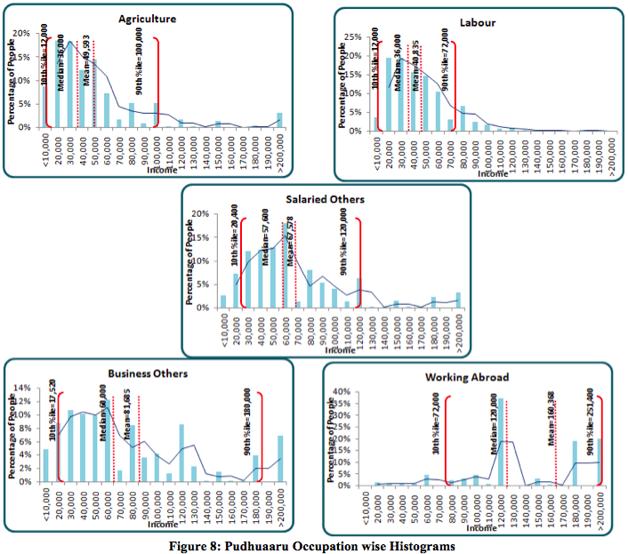
Figure 8 shows that in Pudhuaaru, the income distribution for occupations like Agriculture, Labour and Salaried-Others are in a very narrow band whereas for occupations like Working Abroad and Business-Others the distribution in much wider.
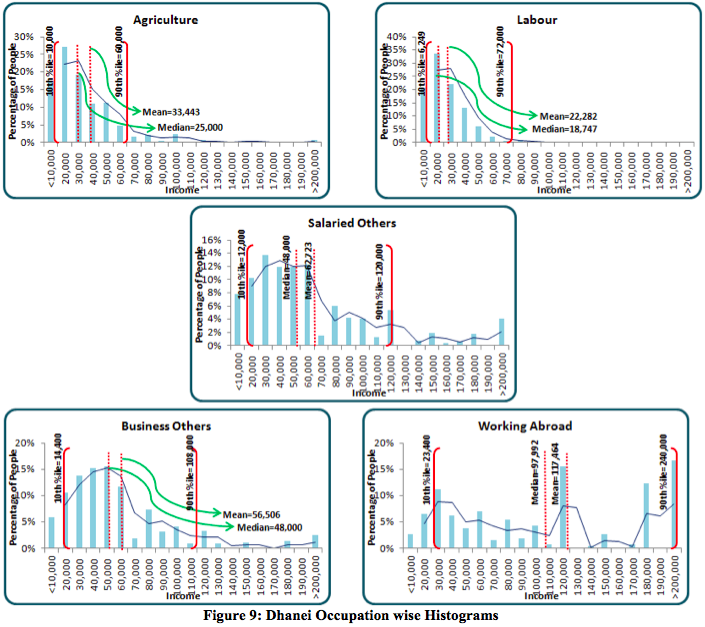
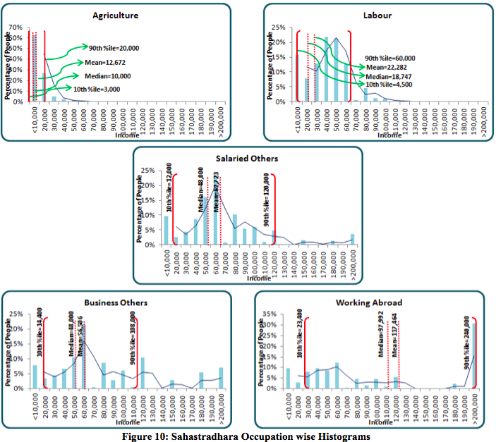
Figure 10 shows in Sahastradhara, the distributions of income from two occupations stand out: Agriculture having a very narrow and tight band and ‘Working Abroad’ having a very wide range.
This analysis has not been done for Thenaaru and Vellaaru customers as the numbers are too small to show any visible trend.
Detailed analysis of gender and age break-up for different occupations
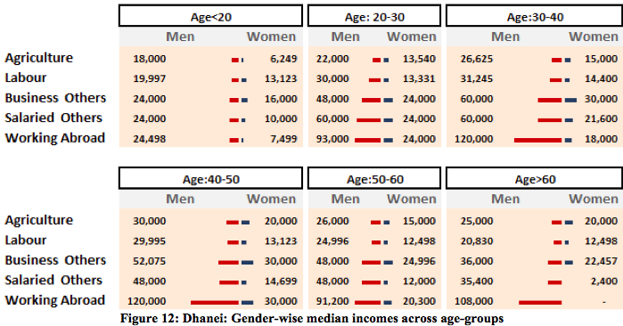
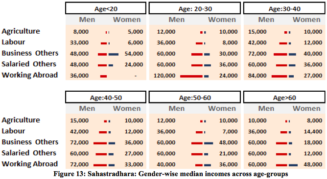
The following figures show the gender-wise median income for each age-group for the top 5 occupations
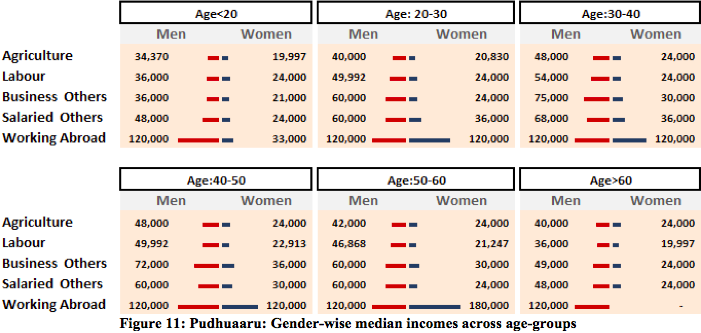
There is a gradual decrease in median incomes beyond 40 years for most of these occupations. This has implications especially for labourers and wage-based occupations where there is a need to think about maintaining a steady flow of income. This also indicates the age when people of different occupations begin to retire. The gap between incomes earned by men and women is also evident here.
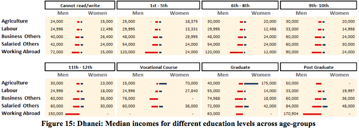
Detailed analysis of gender and education-level break-up for different occupations:
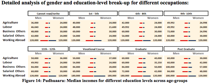
In Pudhuaaru, better education levels do seem to have a positive relationship income across all the occupations although this relationship is completely not linear. Graduate and Post Graduate levels of education have a clearly higher income for salaried and business occupations.
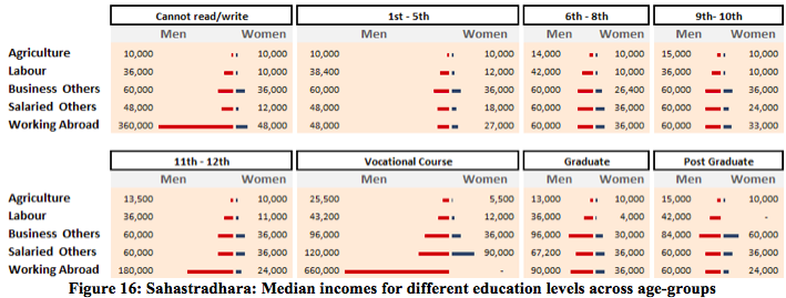
In Sahastradhara, there is no visible trend seen in income earned or education qualification across occupations.
All these analyses would help us in improving our own understanding of our customer incomes for different occupations, age-groups, gender and education levels. This will also feed into our work around product development, wealth management and most importantly data collection in CMS.

