
The role of data in shaping public perception and informing policy decisions cannot be emphasised enough. Given the shift towards increasing digitisation and an influx of data points that is now available in the public domain, it is fundamental that one has an improved understanding of the nuances in handling large volumes of data and in better appreciating the different facets that accompany it. Beginning this post we intend to interview prominent experts in India and abroad, who through this series, will help provide an insight into the process of collecting, collating and interpreting data and ways in which these could be effectively disseminated. The series will also cover the technical, legal and design aspects that make data, and the accompanying challenges, a fascinating subject that has both universal appeal and relevance.
In the first post as part of the series we feature an interview with S. Anand. Anand is the Chief Data Scientist at Gramener and is an accomplished expert in handling large datasets having worked extensively across public, private and government entities. He uses insights from data and communicates these as visual stories and is a well-known figure in the Indian data science community. In this two-part interview he shares his thoughts on data visualisation and the different aspects that one has to keep in mind while undertaking such an effort.
Note: Credit to Kaliamoorthy A, IFMR Finance Foundation, for the transcription.
What are the some of the key trends that are fundamentally driving data visualisation as a field globally? Is there something unique about how it is shaping up in the Indian context?
A strong trend that I see is that there is a lot of automation that is happening that can be captured in three aspects:
- Visualisations are getting automated: It is no longer the case that people are subtly creating data visualisations. We are steadily moving away from infographics which are custom drawn and used to convey data to more automated, data-driven visualisations where the design itself comes from the data.
- Analysis is getting automated: There are enough patterns of analysis that work across datasets irrespective of the domain and in many cases quite independent of structure as well that lead to patterns of insight. So for example questions such as: “what influences what?”, “what do the outliers look like?”, “What items/elements of the data are similar?” are questions that seem to be applicable across almost any dataset. Once we have the data in a moderately standard structure irrespective of the domain, people are able to apply automated techniques to analyse the data.
- Story telling is also getting automated: There are enough ways in which one can communicate insights around a certain pattern. To give you an example: The below work is where we were doing a simple narrative visualisation and at the same it has elements of automation. In this example the reaction of the stock market to the budget announcements is captured, so for instance on the day after budget how does the stock market move in various years. If I have to pick, say, the year 2008 you can see that the banking and financial services didn’t respond too well whereas Oil and gas industry was neutral and Telecom industry reacted well.
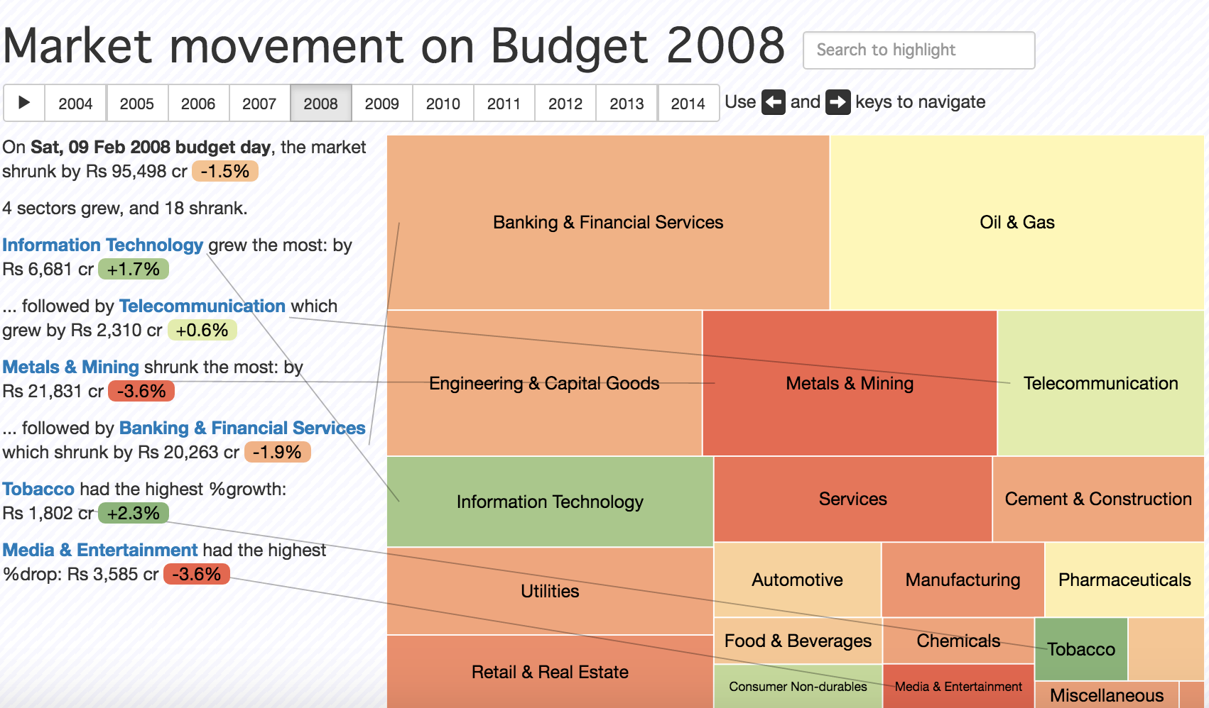
There are some annotations on the left. All of these are generated automatically using what are very obvious templates that one can see working behind the scenes. Once you have enough of these templates and if you decide to show some of these only when it is an interesting statement, then you’re approaching what is effectively borderline artificial intelligence in the sense that’s what a human would do. One would look for a series of patterns and tell a story based on that. So narration of the story is also getting automated in some way. This is probably the strongest trend that I see in the data visualisation space.
In the Indian context, the market for data visualisations is growing as more people and organisations are becoming aware of data visualisation as a tool for effective communication. There are many people from India who are contributing very strongly in this sphere. For example, Vega is a famous data visualisation library and one of the chief contributors is Arvind Satyanarayan. So, there is considerable work that’s happening in India which will hopefully bear fruit in the future.
What are the fundamentals of a good visualisation effort? Are there any nuances that someone has to keep in mind while balancing breaking down complex data and its visual presentation?
Every data visualisation is a function which takes in data and transforms it into certain visual attributes. Therefore, all the principles of standard design apply. The reason I mention standard principles of design is because these are often forgotten when one starts looking at programmatic design. We spent a lot of time putting together work that constitutes “not bad” design and in the form of a poster, a simple one-page PDF, that explains how one should go about creating better design.
Beyond that, in terms of how one goes about getting a good data visualisation, a good resource would be ‘Noah Illinsky’s book: Designing Data Visualizations. Particularly, one table from the book which shows various encodings that can be used to transform data into a set of visual attributes.
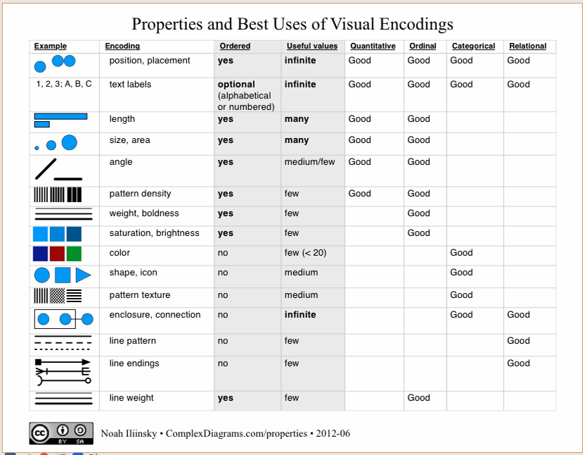
This list by and large covers most of the possible visual attributes set one can map the data to. Given some data, I can represent the data in terms of a position on the X axis and Y axis. I can represent it as a measurement of length, size, angle, colour or a variety of other parameters. Different types of data work well when they are assigned to certain encodings. For example, for representing ordered data, colour encodings aren’t always best as it’s not clear whether yellow is larger than blue or smaller than blue. Whereas colour encoding work really well for categorical data.
These are also ordered roughly in decreasing order of effectiveness. We are much better at discerning position than we are at discerning colour. So if I have to take a column of data and use it to represent a visual in an accurate way, then position is our best way i.e., scatter plot is usually an excellent choice. On top of that if I wanted to add another parameter, for example, I could use area as one of the dimension and position as another dimension. Adding different parameters one can create a new type of chart.
Broadly there are two ways in which we can evaluate a visualisation: aesthetics and functionality. This table also gives us a way of evaluating whether a particular visualisation is better than another functionally speaking. We can make sure that we are using an optimal encoding for the data and at the same time not violate any of the basic design principles.
It doesn’t talk about aesthetics though, which is a different topic altogether. While we can easily argue that a pie chart is worse than a bar chart functionally, it is not that an easy argument to make from an aesthetics standpoint. In terms of functionality, we know what the rules are as explained above, whereas for aesthetics we don’t know what the rules are, at least I don’t!
How would you characterise the demand for Data Visualisation driven Journalism as opposed to the more traditional forms such as anecdotal evidence and story-telling?
A happy development in recent times is that the role of data itself in journalism is growing. Visualisation in journalism has always existed in many forms. Infographics, as a specific aspect of data visualisation in journalism, has always been there especially in scientific journalism. The Scientific American data visualisation team, for instance, is spectacular. The kind of visuals they come up with are amazing. So, it has always been there, however its gaining more prominence now.
I think that there is a huge market for stories. Ultimately people consume stories and visuals are useful. In fact it’s quite interesting if you look at any newspaper or magazine and remove all that text and look at just the pictures and try and see if you can guess what the story is about. More than half the times you will find that you actually can’t figure out what the story is about from the picture. The picture is not there at all to explain the story or to elaborate the story. It exists, by and large, to make things look prettier.
At a recent conference, I pulled out a random story from a newspaper which had a picture that was an aerial view of the city. Just looking at that picture, the story could have been about anything. It could have been about traffic, about riots in the city or about retail growth in the city etc. It happened to be that it was about how the construction industry is slumping. The point is that the story is what is selling from a journalism perspective but not the visual. Therefore, the market while it’s growing, will probably saturate at something smaller than what at least the data visualisation enthusiast hopes for. On the other hand, data driven journalism, irrespective of the visualisation, has the potential to scale a lot. That’s because data is a source for stories.
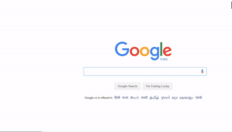
Let me show you an example of a considerable data visualisation story that is scalable. Just go to google.co.in and type in the words “how to”. Now you will get four suggestions:
How to kiss, how to download YouTube videos, how to lose weight and how to reduce weight?
In some sense, this represents India’s priorities today at least as far as the google search is concerned. This is a source of insight in itself and what if we could capture all of this and put it into a list and say if you start searching for “how to” – what are the recommendations in different countries? Can it provide startling insights into what different countries are thinking of against various kinds of questions? This is a point-in-time analysis and it keeps changing every day and this tool gives you an insight into the ever changing minds of geographies over time.
This is not a story but a source for several stories which is what makes data journalism powerful. So, I believe that data visualisation in journalism has been there, is growing and will grow little more. But data itself in journalism has much more potential.
In the context of trying to visualize and disseminate data which would impact, lets say public policy, how important is it to keep in mind the target audience for a visual?
The context is at least as important as the data itself. A piece of data can explain very different things to different people. Similarly, the same inference can also come out from very different pieces of data. The context and data together is what drives good data visualisation.
To give you an example of how the context can completely change the structure of a visual is our work on the 2014 election results page. When we came up with the initial sketch, we thought, we had arrived at a reasonably sophisticated visual that covered various aspects in a dashboard that most people would like. However, there were several problems with this. With subsequent feedback and multiple iterations later, the final version was completely different from the visual we had in the beginning.
Even though we thought we had a pretty well-designed original visual, the contextual feedback helped create a visual that addressed the questions that the audience would like answered. The same data can tell different stories, important is, which is the one you want to tell? And that depends on the audience and what they find interesting.
Part 2 of the interview will cover aspects of challenges in public vs. private datasets, data privacy and open data movement.