
This post is a continuation from our earlier post about a conversation with S. Anand, Chief Data Scientist, Gramener. The earlier post covered the fundamentals of a good data visualisation and the nuances one has to keen in mind while undertaking such an effort. This post will cover aspects of challenges in public vs. private datasets, data privacy and open data movement.
In addition to working with individual organisations on data specific to them, Gramener has taken an interest in disseminating data relating to socio-economic issues such as Parliament elections, socio-economic census etc. What have been some of your personal experiences in working on public datasets? What are the challenges that you face when working with public datasets as opposed to private/organisation datasets?
Let’s talk about challenges: Now the good part about open and public data these days is that they are reasonably well structured. When comparing private and public datasets, there are three commonly discussed issues:
Data Cleanliness/quality: There are always data collection issues but I don’t see this as private/corporate versus public data source issue but I see it as manual versus automatic data collection issue. If I had to go to a bank in which account balances and transactions were entered manually, it would be just as messy in a private organisation as in a public organisation. Whereas, institutions where it’s collected through a system, it is obviously much better, irrespective of whether the institution is private or public. So it’s merely a question of: to what extent has automation entered a domain. Therefore, data cleanliness is not an issue that distinguishes public data from other kinds of data.
Availability of data: is commonly brought up too. There are a lot of people that tell that public data is harder to get one’s hands on. In my experience, private data is no easier. When we are called in to do a project for a private organisation, we ask if particular pieces of data are readily available. The answers you get are not particularly different from the answers you get from a government which is:
- We don’t know if data is available
- If it is available, we don’t know where it is or who has it
- If it is available, then we don’t know what format it is in
Often times, we have been asked by both government and private organisations to scrap their own website. So, availability of data is also an issue that doesn’t distinguish private and public data either.
Data Linkages: Something that does distinguish the two is the linkages. A lot of public data is not standardised by the entities that use or provide it. For example is there a standard district code? The answer is ‘yes’ not one, but several hundreds of standards. Is there a standard school code? Is there a standard village code?
Every organisational unit in the government tends to have a say in what standards they pick and very often they pick differing standards. These differing standards can be seen even within organisations. For example, if I go to NCERT to collect information about marks of students and information about infrastructure in a school, these two pieces of data cannot be merged because there are no common set of IDs. It’s only now that this need for standardization is coming in because there have been several grassroots initiatives around standardization. So, the single largest problem in working with public data is that it is often difficult to link across datasets availability.
Many governments are moving towards an “open data” culture by making datasets publicly available in order to increase transparency (For example: data.gov.in). What are your thoughts on the impact of these movements and how crucial can visualisations be in making sense of such large volumes of publicly available government data?
Open data movements are clearly good in the sense that you now have access to more data and more can be done with them barring privacy concerns. It also allows the government to outsource and/or rather crowd-source some of its analysis. So why should I have to create a team that does analysis when I can get the public to do the same work which certainly helps.
How does visualisation help? It can help us understand better some things that are not obvious. To take an example: we were recently working with the Ministry of Finance on a project to help them understand the budget in a more intuitive way, from under-spend and over-spend respectively.
So we put together a standard tree-map kind of visualisation where we have boxes, each box represents the size of the budget, the colour represents the degree of under-spend or over-spend.
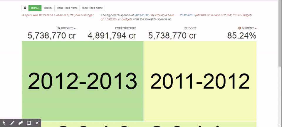
It is easier to see that one department is spending considerably more than others and some departments spend considerably less. You can now break it down into various sub-departments to see where exactly the problem is coming from, move back and so on. These kinds of explorations make it easier to argue and debate and we are no longer stuck in a situation where you have to understand raw numbers. The task is now simplified to looking at something and focusing on the conclusions. It becomes a lot easier to see what was otherwise a much more complex or intractable item. These visuals also help you explore the dataset in a much more intuitive way.
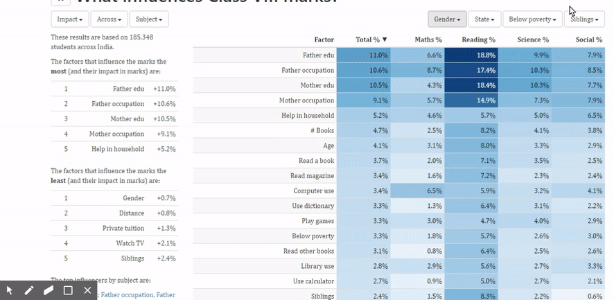
Another example: We were working on a semi-public dataset along with NCERT on the national achievement survey. The question here was: what influences the marks of students? Can we identify the social and behavioural characteristics that have an impact on the child’s marks? This was done on a reasonably large sample (100080 children) across the country studying in class 8.
 The complete analysis is available here.
If you look at the table where it shows a variety of factors –for example the gender, age, mode of education, reading books etc. and the influence that it has on the total marks as well as marks by subjects. Let’s take the number of siblings as an example. So the number of siblings it says has a 2.4% impact on the total marks. How does that break up? What it shows us is that individual children scored more marks than children who have one sibling who score more marks than two siblings than three siblings. This does not necessarily indicate that having siblings hurts a child. It’s probably just a correlation between various other economic factors. But we do know that the extent of influence that the number of siblings has is very real. We can start looking at overall influence on each of these parameters to say what has a larger influence that enables us to explore these relationships in more detail.
For instance, one of the things that we now know is that watching TV is not such a bad idea in fact if I look at the overall impact of watching TV against the various subjects, it shows us that reading ability actually improves if children watch TV every day. On the other hand, mathematics ability is dropped dramatically if they watch TV every day. It tells us watching TV once a week roughly is a sweet spot for scoring well in most subjects. On the other hand, if we take a look at how much does playing games make a difference and it turns out that it’s almost exact opposite. Playing games improves mathematical ability considerably but actually hurts your reading ability a bit. Of course never playing is a bad idea. The extent to which you play has a different impact on different subjects.
This sort of analysis would not be possible if the data didn’t come out in the open. Even if this kind of data is available in the open, it requires a good visualisation for it to reach a wider audience.
With the increase in the amount of data being collected and shared by various organisations, what are your thoughts on data privacy?
My thought on this is that any data collection and capturing mechanism makes data privacy a serious issue. Open data, on the other hand, improves the situation from a data privacy perspective. I will give you an example. Let’s take land records: who owns a particular piece of land is very useful information. Also consider data from the voter registry: who are eligible to vote is very useful information- at least for certain sets of people. Considering that both these datasets are available to the government and not available to anyone outside the government, it means that the government has more influence and power than public. This effectively means that to a certain extent the incumbent party is more influential or anyone who manages to get access to the data, within the framework of the law, has more power over someone who doesn’t have access to the data. The data exists and continues to exist ever since people have been writing down on paper and pen voter rolls.
Technology is what is raising the privacy question. Today we are living in a world where there is incredible power and technology where we have the ability to track where a person’s mobile is at any point in time, who they are calling etc. This information is certainly available to the ISPs and to any party that has the ability to subpoena this. Open data is merely making it available to a wider audience. So i see open data more as a leveller that at least makes the lack of privacy more uniformly distributed than it really is.
The fact that when data is open, we would have to enforce controls on it and enforcing it in a reasonably uniform way means that the discussion is brought out in the open. Earlier, what was a privately debated and privately enforced policy is now going to be a publicly debated and publicly enforced policy. The fact that open data is bringing that discussion out in the open and also making data access more uniform is good. The privacy issues stem not from the data but from the existence of the technology itself. The case of NSA and Edward Snowden has shown us that there exists authorities who have the ability to extract the data. The question is now how does one govern these authorities. This discussion becomes easier if you say that the same data is potentially, in some form or the other, available to anyone.
Aside from data visualisation as a method of disseminating information, you have also been recently talking about the emergence of Data Art. Can you tell us more about this?
It is certainly at a nascent stage. Data art, if I have to term it, I would say it is something that uses data to create art without purpose or any specific objective. This is relatively new and people are dabbling around with it in the same way that people have been dabbling with new art forms in the past.
People who were purely focusing on aesthetics are now paying more attention to data and how they could utilise it. For example, design schools such as NID and Shrishti etc. are now talking about data visuals. We are also seeing clients, who were earlier focused on the aesthetics, are now interested in moving towards infographics. Media is a classic example: they were earlier focussed on stories and narratives but now are moving towards infographics and in a few cases, are moving towards data driven visual representations.
On the other hand, people who were focussing a lot on the hard content and numbers are gently moving towards more visual representations as well. Financial Analysts are now saying that they would like to see data in a visual representation and companies are wondering if they can make their annual reports more pleasing purely from an aesthetic perspective. So right across there is clearly growing appreciation of this intersection between aesthetics and data per se.
To give an example of data art, consider this visual:
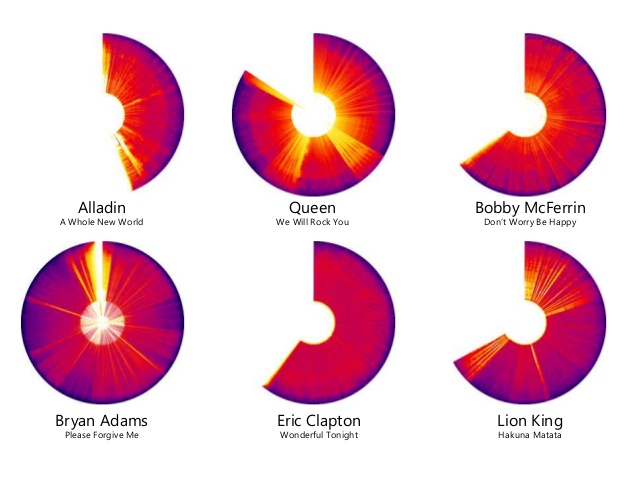
This is directly drawn from data where each of these represents one song. The arc tells you the length of song and the completion of arc represent a total of six minutes. Within that, the strips represent the spectrogram of the song, effectively the frequencies and the beats of the song. So queen’s “We will rock you” has different beats in between that has a very different structure to Eric Clapton’s “Wonderful Tonight” which is remarkably uniform and homogenous. One could argue that this could be useful to understand the structure of the song but in reality it has no purpose. It was created because it could be done. In some sense, art is done because you can do it and because you feel good while you are doing it and not because there’s an audience in mind whose objective you want to satisfy.


One Response
While the benefits of collection and usage of data have been well articulated, there are a couple of fundamental aspects that don’t relate to tech, per se, but have a bearing on tech.
Most institutions including private banks, do not integrate their systems to eliminate data error. As a result, its fairly routine for customers to re-write forms with basic personal information when accessing a particular product, even when the bank already knows that she / he is a customer already. The errors in multiple entries (which is mostly manual) then compounds basic services issues for customers. I’ve had several recent experiences with leading bank, telcos on this – and in general, its messy, cumbersome and prone to errors.
The second aspect, touched upon in this article is that govt needs to make several records accessible (subject to normal prudence on usage rights) – for example, land and property records. Its a basic information that will revitalise asset transfers or usage (e g collateral) that are quite fundamental to a household’s finances.
In both the above examples, no law or policy holds back either service providers including govt (a service provider) from making the best use of data they have and tech they deploy. All the fantastic downstream benefits will only be possible when they shake off their inertia.