

This is the second in a series of blogs which describe our efforts towards building an effective in-app GRM for India’s consumers
Based on findings from field study, we created prototypes with mock screens representing various parts of the user grievance redress journey, from accessing the GRM, to raising a ticket, and obtaining resolution.
The designing of prototypes involved mapping the existing resolution process for leading UPI apps for those issues prioritised from the field study. This was done iteratively to systematically refine our design approach through the creation of both low and high-fidelity mock-ups, and resulting in a comprehensive prototype.
Entry into Help
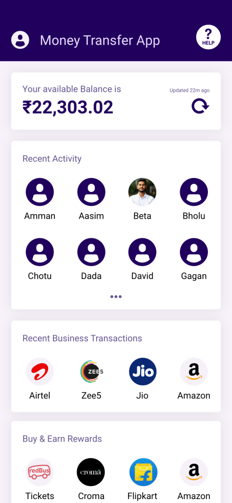
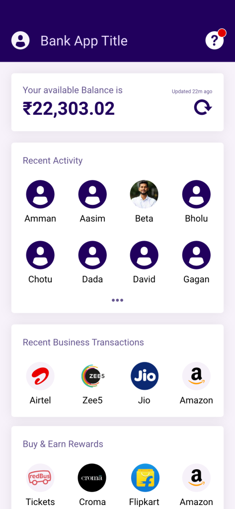
To enhance the accessibility of GRMs, our prototype provides multiple upfront entry points into the GRM – one through the ‘profile icon’ menu and another via the ‘question mark’ icon located at the top right of the prototype for the home screen (See Figure 1).
The latter provides a direct, single-step access to the GRM functionalities of the UPI app through dedicating app real estate on the home page. Its placement on the top bar facilitates ease of discoverability for the user.
This approach can be especially useful where users may not have a transaction reference for their grievance, (such as with onboarding issues or incoming but pending transactions, where entry into GRM through the transaction detail page will not be feasible).
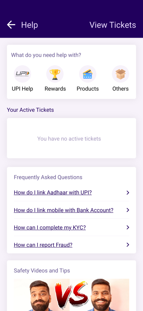
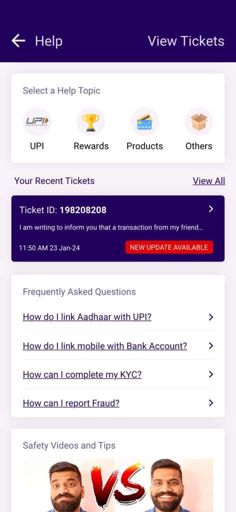
Help’ Landing Screen
Once users have entered the GRM, they are presented with a screen where all help-related information is housed.
This landing screen (see Figure 2) allows the user to select an entry point relevant to the grievance they are experiencing. The first section in the Help landing screen, titled ‘What do you need help with?’ contains subsections of the grievance mechanism relevant to the various product offerings of the app. The user’s choice directs them into a subsection of the menu relevant only to their concern – unrelated grievance categories are filtered out upfront and the user is less overwhelmed by having to choose from irrelevant concerns.
The app may also host information about active tickets and include sections such as Frequently Asked Questions (FAQs) to help the user learn about product features.
Navigating the Problem Tree: Problem Identification, Data Gathering & Resolution
Once the user has entered the grievance redressal section of the app, the process of identifying their problem, collecting additional information pertaining to it, and resolving it begins.
These steps comprise the ‘Help Navigation Tree’, which outlines the sequential steps that users should follow to navigate through the support process effectively and efficiently. We have followed a ‘narrow’ tree approach, which is more effective for the user.
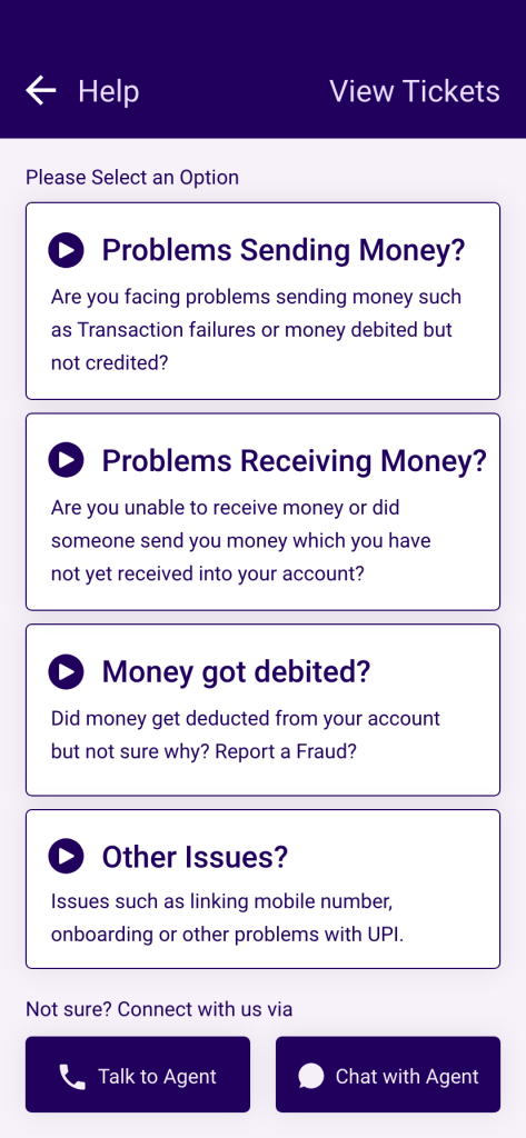
First, they can describe their problem by selecting from the four options described below. This screen (Figure 3) constitutes the problem identification stage, and the user’s navigation of this screen leads them to the data gathering stage. These short, easily understandable phrases (which can also be comprehended through the provided audio-playback button) can help the user categorise their grievance without much cognitive burden:
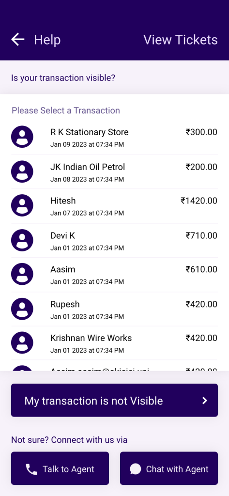
- Problems Sending Money: For users incurring payment-related problems, such as a failed or stalled transaction. If the user chooses this option, they are redirected to a screen to select the relevant transaction from all outgoing transactions (including pending / in-progress) (See Figure 4). When the user selects a relevant, this allows for the GRM to gather data on the transaction (data gathering).
- Problems Receiving Money: While typically, UPI in-app GRMs only allow grievances to be raised from the payer’s perspective, we have included the category ‘Problems receiving money’ to allow aggrieved receivers of money raise grievances as well. This enhances users’ trust and comfort in the service. If the user chooses this option, they will be redirected to a screen to select the relevant transaction from all incoming transactions (See Figure 4). If the transaction has not been successful yet, it will not show up in the list of incoming transactions. For such situations, an additional ‘My Transaction is Not Visible’ button is also provided. This approach ensures that users can provide detailed context about their issue, either by selecting a specific transaction or by providing relevant information to initiate a ticket (data gathering).
- Unknown Payments: Covers issues related to unidentifiable or unauthorised debits or credits from or to the user’s bank account. For instance, money has been deducted from the user’s account, but the user is unclear or is unable to identify or recall the payment. Users could have grievances related to fraudulent deductions or Autopay mandates which do not currently come under the scope of transaction-related grievance mechanisms. For more details on how these prototypes handle grievances related to Autopay and Frauds, see our Design Toolkit.
- Other Issues: Addresses miscellaneous issues such as mobile number linking issues, issues with on-boarding, new payment instruments, or KYC-related queries.
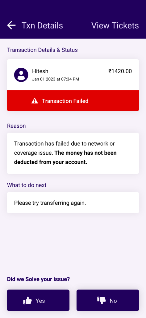
This prototype prioritises self-resolution (rather than creation of tickets through guided resolution steps) by emphasising the provision of providing information to the user, in an automatic manner. This information on the nature of grievance, reason for its occurrence, clarity on actions required, etc. can provide users clarity and facilitate resolution of certain issues in an independent and efficient manner (see Figure 5). The resolution screen must contain the following elements:
- Reason statement, containing the potential reason for the issue encountered, in clear and straightforward language.
- Actionable steps for the user are made apparent, such as waiting for a specified number of days, reattempting the transaction, contacting customer support, reporting fraud, or following predefined in-app troubleshooting procedures.
- Feedback loop on whether the issue was resolved, by asking the user “Did we solve your issue?’
- Option to speak/chat with agent, is made available to users who may still wish to exercise this option.
Creation of ticket
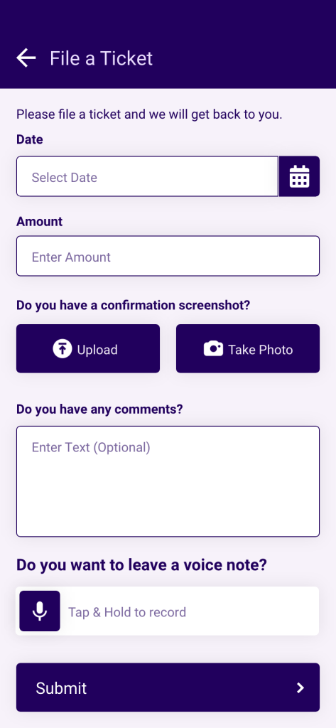
In some cases, the self-resolution approach may not be sufficient in providing satisfactory resolution to the user, and creation of a ticket may be required. A ticket can be created when the user selects ‘Unknown payments’, ‘Call/Chat with agent’, or declares they are not satisfied with resolution using the thumbs down icon.
For the creation of a ticket, we recommend a structured flow for the collection of data from the user, such that it collects the following details from the user (Figure 6):
- Date of issue / transaction
- Amount in dispute
Additional context or explanation regarding the issue / transaction through a text-box, voice input, and or photos/screenshots (in some cases).
Ticket Confirmation and Acceptance
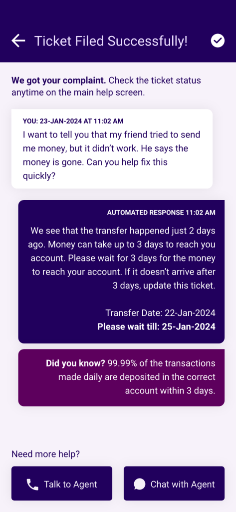
Once the data is submitted, a ticket detail screen is created for the issue. This screen immediately confirms the successful submission of data (Figure 7). It may also provide an automated resolution (in the form of a chatbot response) to the user, which includes resolution steps and follow-up actions. The chatbot responses may be provided in cases where the user has provided sufficient information to warrant an automated response.
The screen also leverages analytics available throughout the grievance ecosystem (and possibly from NPCI’s UDIR) to offer some social validation to the user in the form of statistics, feedback demonstrating expected turn-around-time for resolution of issues, and so on. This reassures users of the platform’s acknowledgement of the nature of the issue, its understanding of the issue’s prevalence, and its commitment to resolving their concerns effectively and in a transparent manner. While some users found the content on social validation difficult to read and understand, others appreciated the information provided and construed it to be a reassurance.
Ticket Tracking
After users have filed a ticket, it is necessary for them to be able to quickly and easily refer to the ticket, especially while it is still active. Users are alerted about updates on active tickets in the following manners:
- a red-dot indicator at the entry point to the ‘Help’ section which effectively notifies users of ongoing issues that may require attention (See Figure 8).
- a dedicated dashboard on the ‘Help’ landing screen which previews all active tickets requiring their attention.
The next post in this series will explore the implications of this work for some of the key stakeholders in the UPI ecosystem.